Investment Firm Website Redesign
A brand and website redesign built during a summer design internship.
Overview
During a summer internship at a private investment firm, I worked on several projects, the main one being a full redesign of the company's public website. I served as design lead for one of two parallel prototype teams, running from May to July.
Problem
The existing site was generic and uninformative: stock photography with no connection to the firm, vague language that could describe almost any investment company, and no clear sense of what the firm actually did or who it worked with. The goal was a more sophisticated, memorable site that used language specific to the company.
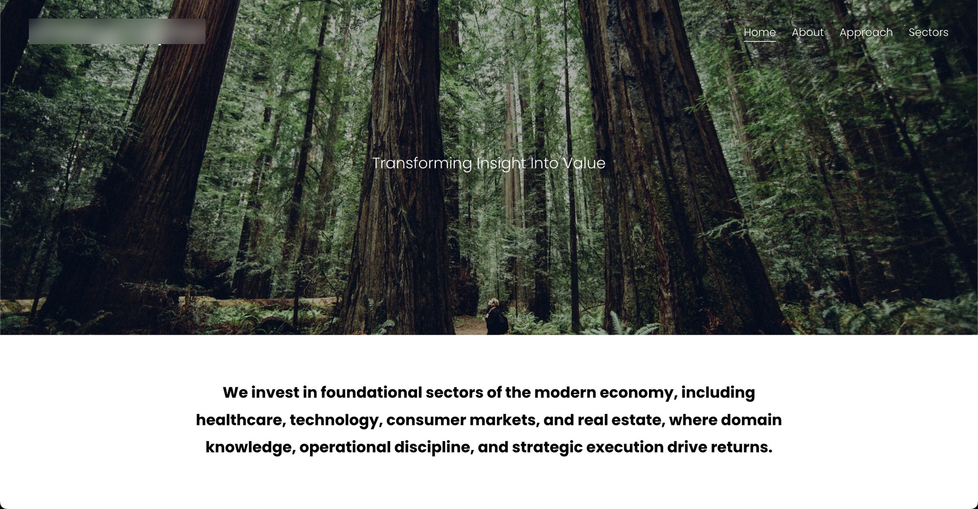
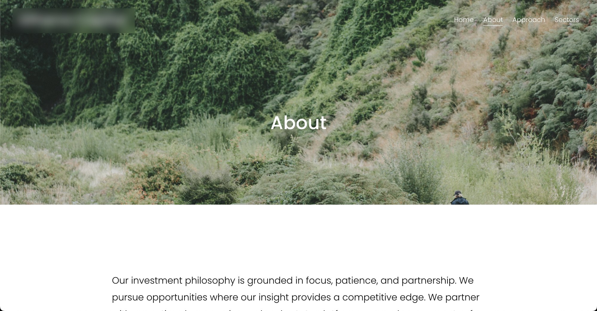
The old site.
Design & Build Decisions
I designed the firm's new logo, which became the foundation for the rebrand. As design lead for our prototype track, we were also asked to try pulling imagery tied to the logo's motif into the site itself. It didn't stick. There simply weren't enough high-quality stock photos available in the style we needed, so we moved away from it, though the logo itself stayed. Several of our layout and structure decisions carried over into the final direction, even as our prototype was later converted into the blue color palette the other team had used.
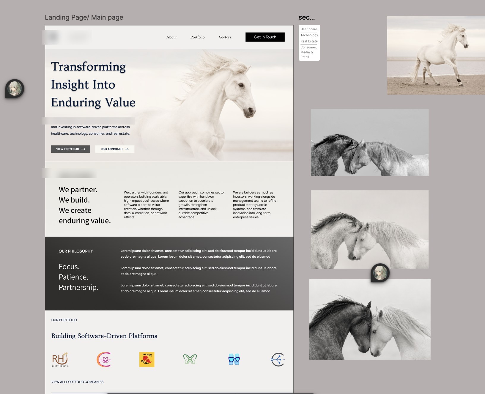
An early draft, and reference imagery, before the direction was scrapped.
As design lead, I delegated work across the team, set the overall direction for our prototype, and handled much of the final-stage tweaking and prototyping. Alongside the other design lead, I also built and ran an A/B test sent out to the full company, testing people's preferences between different layout options and overall color scheme choices. We then compiled and analyzed the results.
Outcome
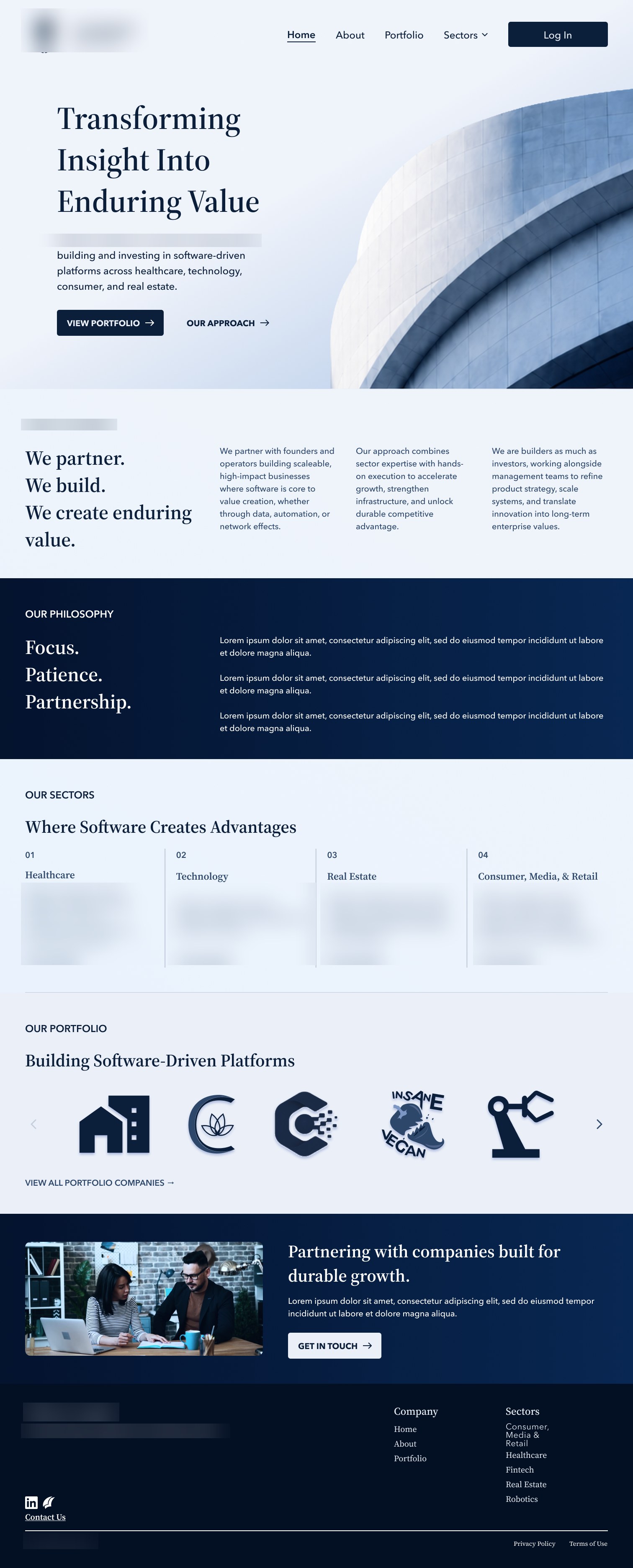
A few cropped screens from a near final draft of the site. The company name and logo are blurred throughout, since the site hasn't launched publicly yet.
Home
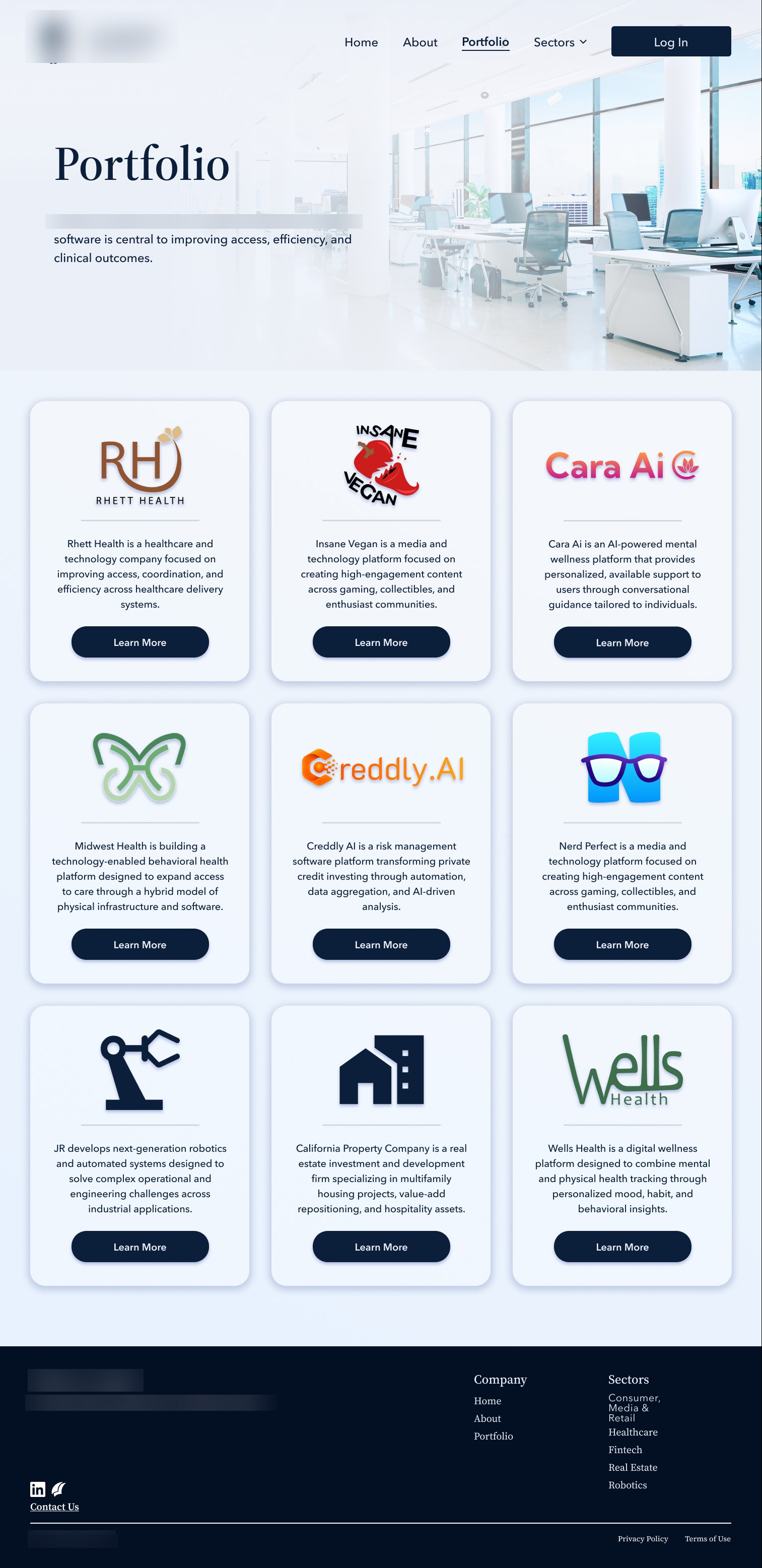
Portfolio
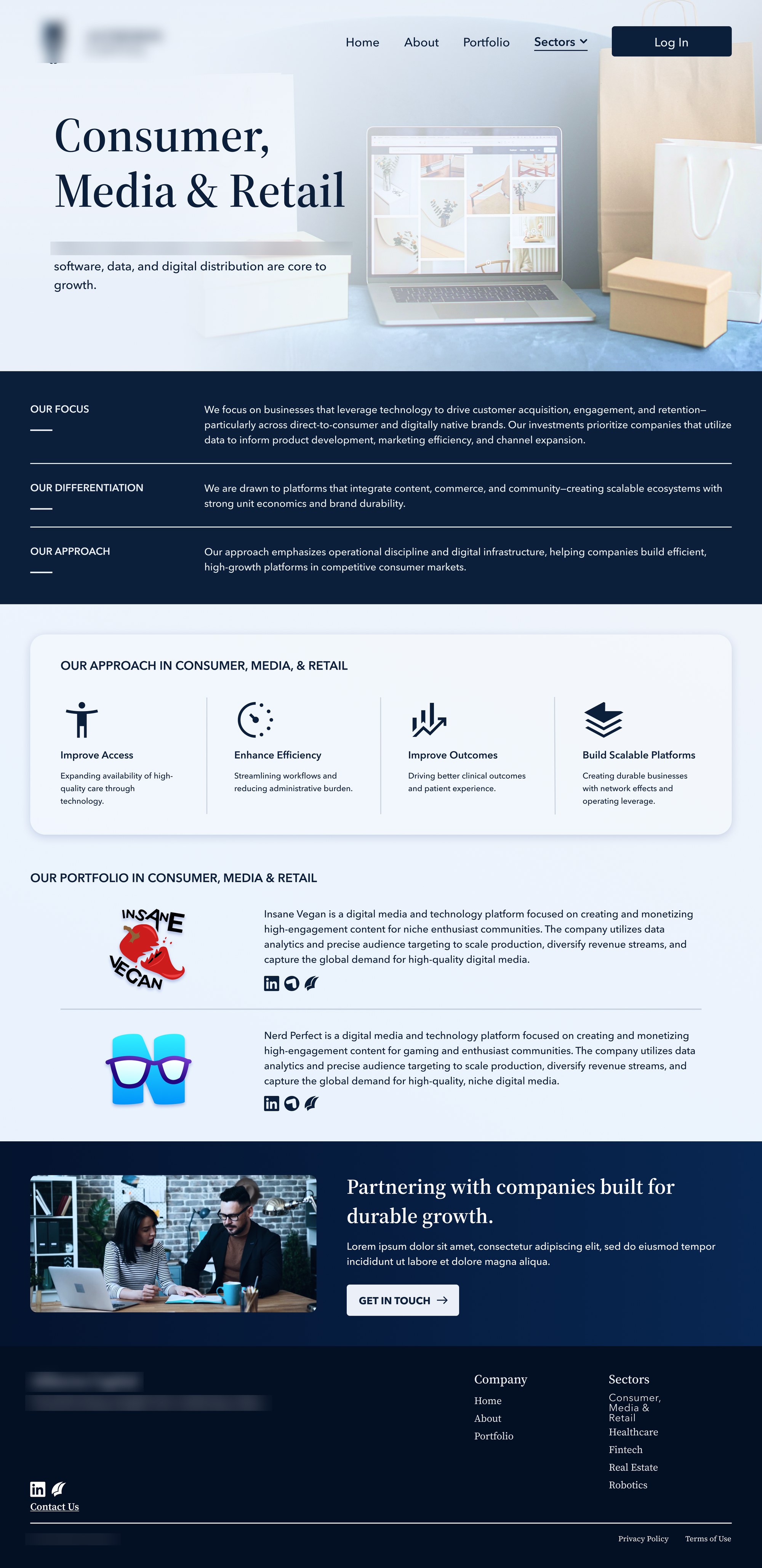
Sectors
Moving Forward
Though my internship has ended, the company continues to edit the prototypes, with a goal of publishing the website soon.