Mary Artz Tax & Business Services: a professional site redesign
A new site for a 20-year-old hometown tax firm.
Overview
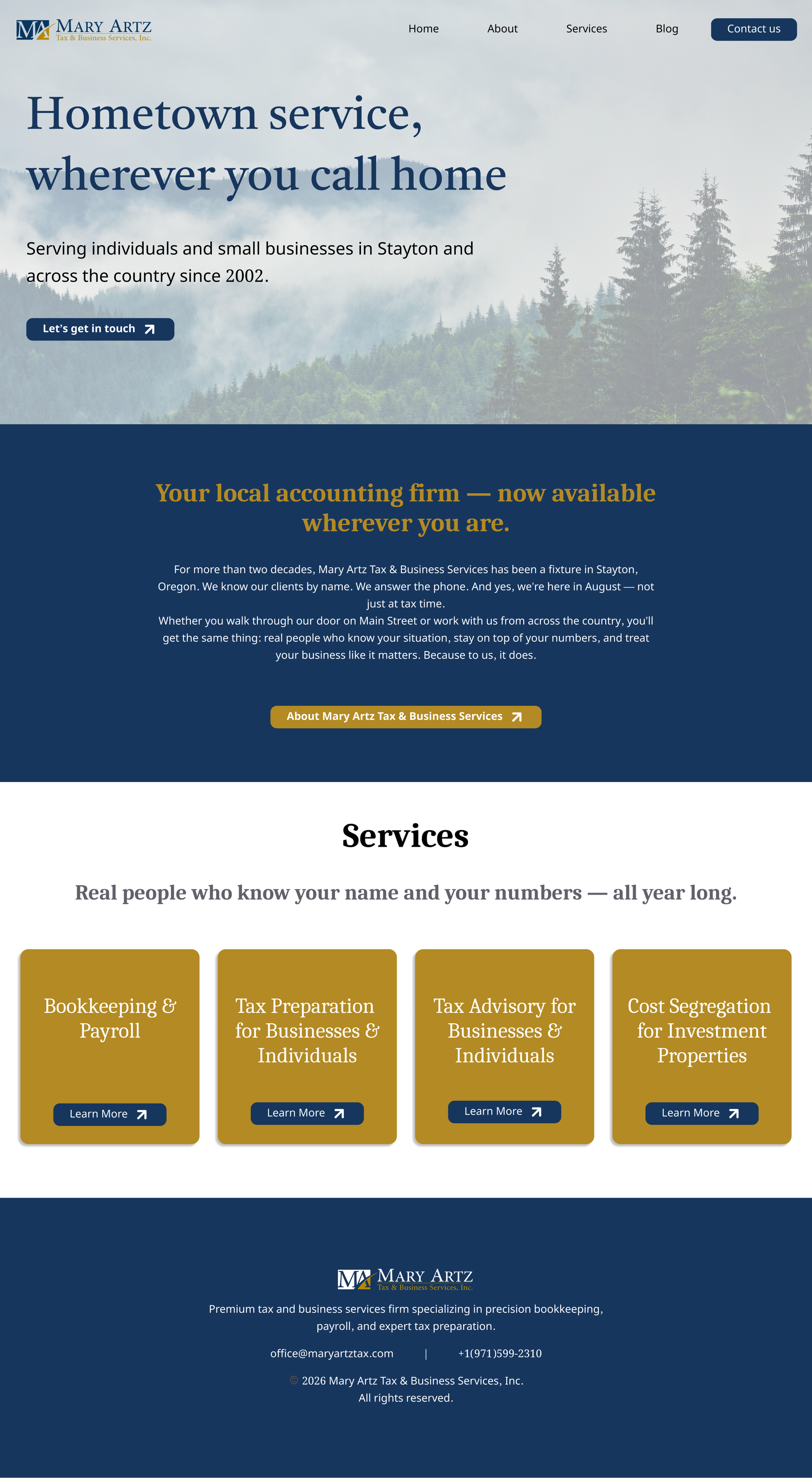
Mary Artz Tax & Business Services has served individuals and small businesses in Stayton, Oregon since 2002. When new ownership took over, they brought me on to replace their dated website with something more modern and personal. The project ran two weeks in August 2026, covering brand direction through to a live build.
Problem
The old site was generally super outdated, full of stock travel photos, a low-res generic logo, a bunch of hidden drop-down menus, and no personal touches or imagery that described the company or its values and history. The new owner wanted something more modern and easy to navigate, built around her chosen blue/gold color palette.
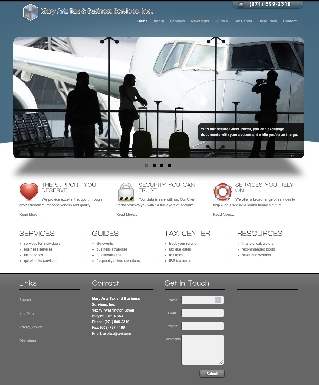
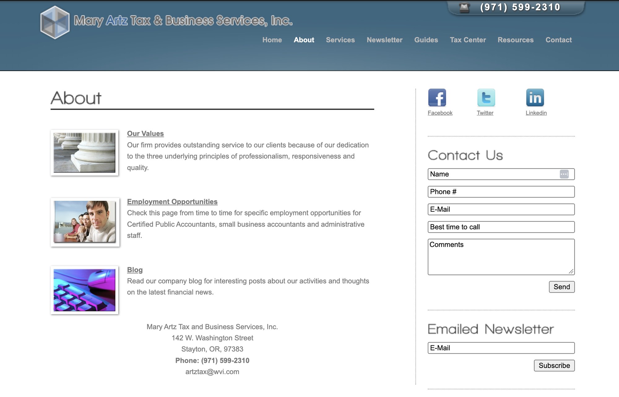
The old site.
Design & Build Decisions
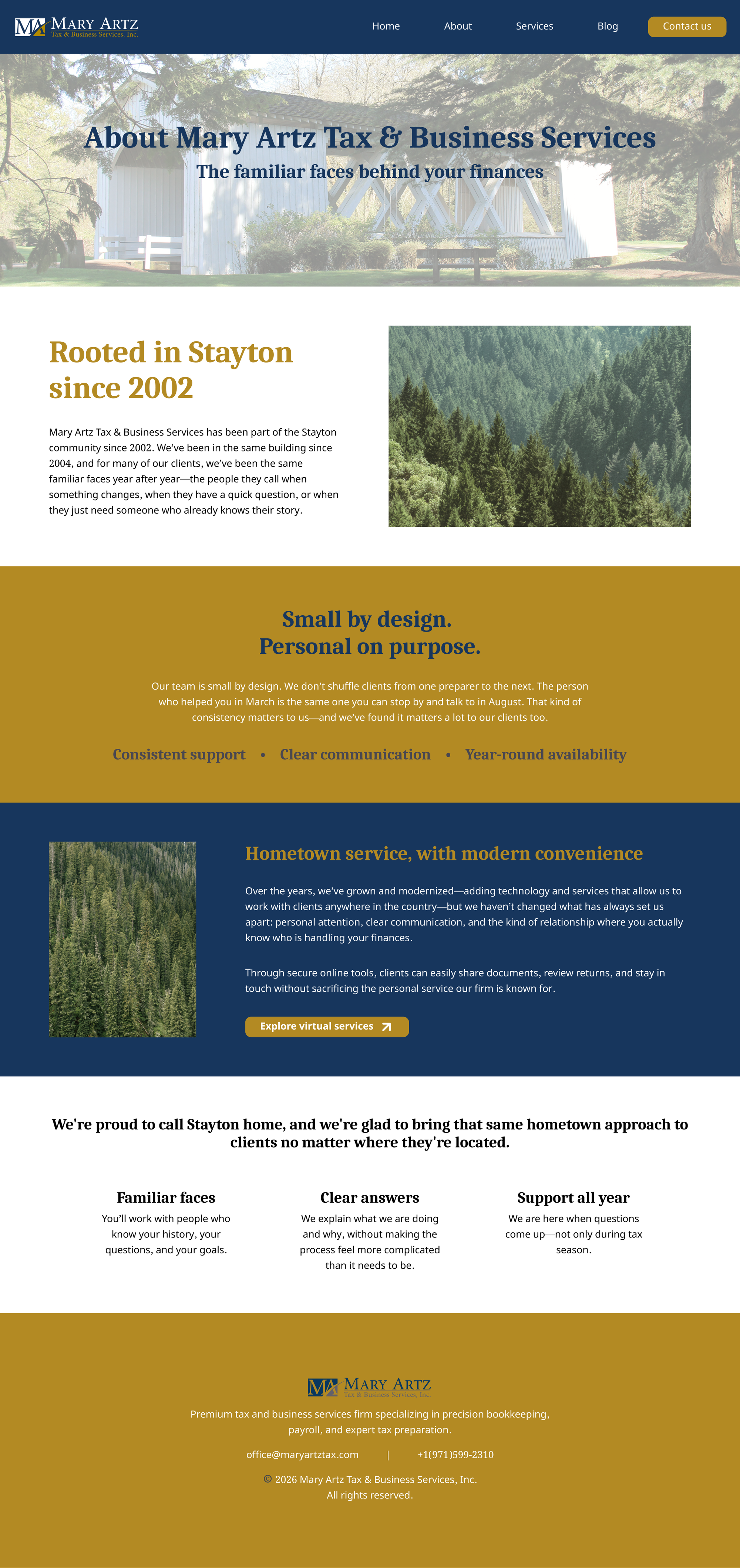
A branding problem came up early on, where there was no existing visual anchor to build around, such as a mascot or object the way her inspiration sites had (a honeycomb motif, a bike logo). Without an object to lean on, we grounded the site in place instead, using Oregon pine forest photography and some Stayton-specific shots (like the town's covered bridge) on the About page. It gave the site a consistent feel for now, with room to swap in real firm photography later.
The build didn't go as planned. I'd designed the site in Figma for the Figma to Wix Studio transfer plug-in, but partway through we found out the client's Wix + Elavon payment setup only works with the Wix Harmony editor, for which no design transfer tool exists. I had to learn Harmony from scratch and rebuild what I'd already designed, including tracking down close matches for fonts that Wix didn't have.
The cost segregation page also needed to show real numbers, not just describe the service. I built a custom HTML/JS widget embedded in the page that takes a few property details from the visitor and calls the RentalWriteOff instant-estimate API to return a projected savings figure.
Final Product
A few cropped screens from the final site.
Home
About
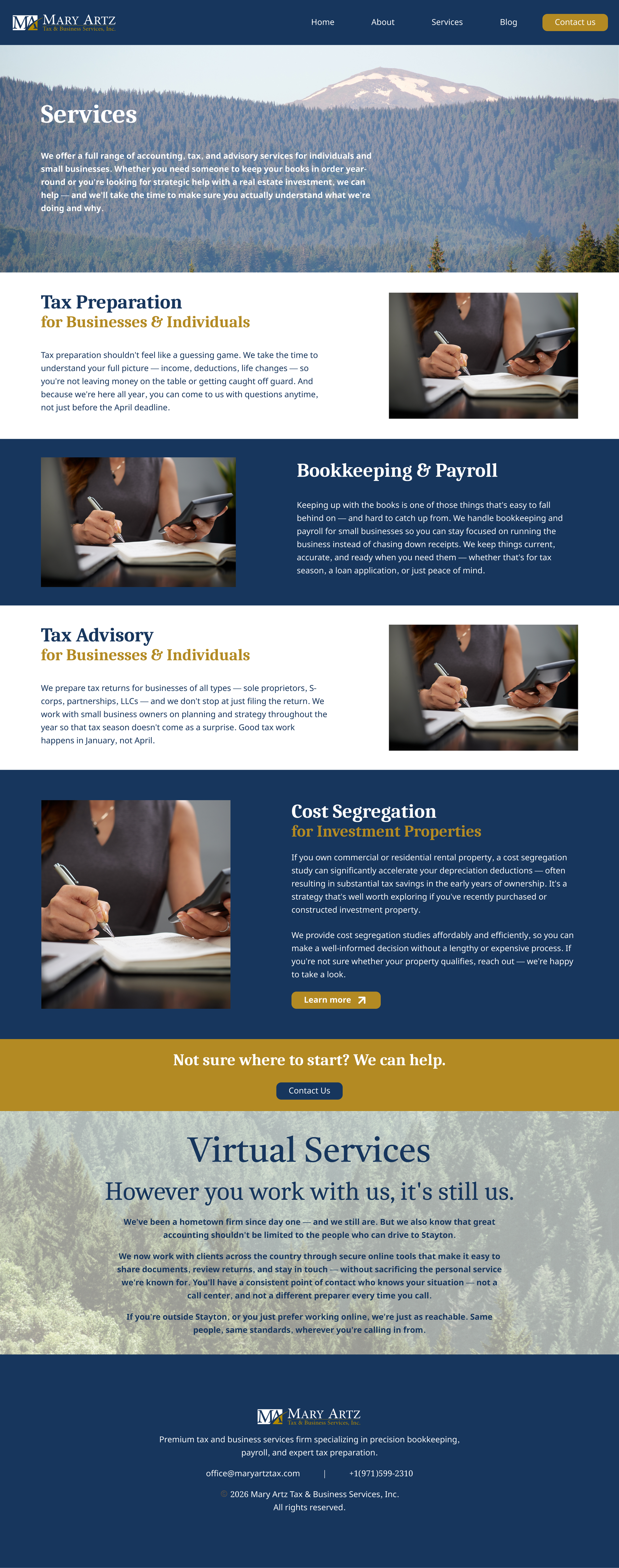
Services — the photos here are fillers until professional photography is ready.
Reflection
Thinking back on changes I would like to make to the site if I could restart, I leaned too heavily on solid color blocks a lot to divide sections, which works but feels a little heavy-handed. And the pine imagery mostly lives as background photography. With more time, I'd carry it into other parts of the design, like icons or dividers, instead of just backdrops.
Next up for the site: once the client is ready, we will insert real firm photography, a blog, and eventually a client portal.