Trofi: a gamified food discovery app for tourists
Turning an unsolved creative brief into a tested product concept, in three weeks.
Overview
During a 3 week long study abroad program in Heraklion, Crete, I and two other students were grouped together and given an open-ended prompt: make a creative product that will help tourists in Heraklion.
Through a week of user need-finding and two weeks of building and testing different prototype iterations, my team created a fully prototyped, gamified restaurant-discovery app, tested with real tourists in the field and presented to researchers at FORTH (Foundation for Research and Technology - Hellas).
Problem
We were not given a problem. We were given a city and a broad target audience (tourists), and were told to be creative. The first week of the program was dedicated to interviewing tourists and narrowing down a problem that we would then solve.
We interviewed on the streets of Heraklion, at the Palace of Knossos, and in museums, working through rejections and language barriers to learn what frustrations real tourists had.
As we narrowed our focus, our target audience and product ideas shifted several times:
The idea that stuck came when we realized that tourists weren't struggling to find food in Heraklion. They were struggling to find authentic food. Many a tourist had fallen for tourist traps, or had wanted to try dishes like lamb but had no reliable way to tell which restaurants were legitimate.
One professor's pushback (our initial idea, a dietary-filter tool, was deemed "not creative enough") pushed us to think beyond a straightforward search tool, as many apps such as Yelp already exist for this purpose.
Solution
We designed Trofi (Greek for "food" and visually similar to the English word "Trophy"), a gamified quest app that turns trying authentic Greek food into a collectible adventure.
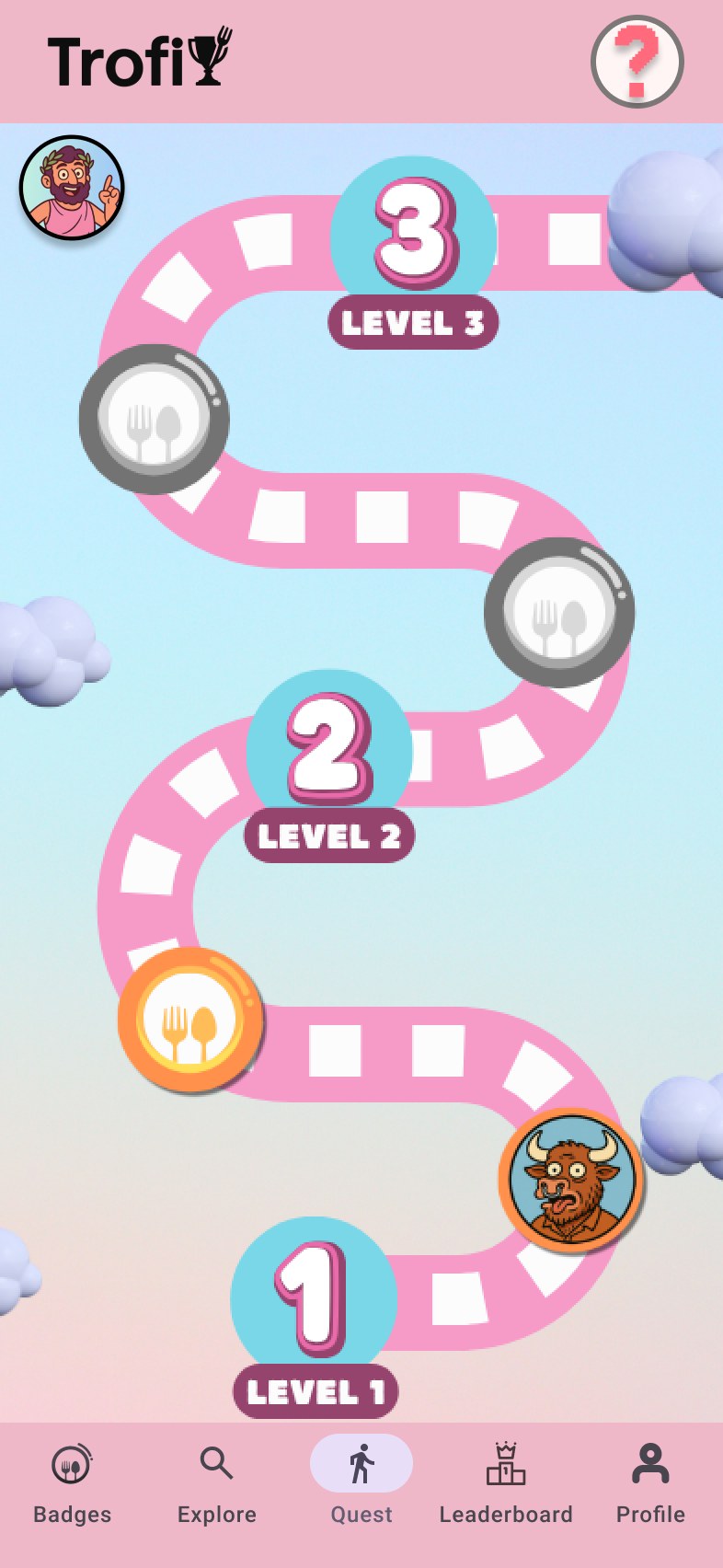
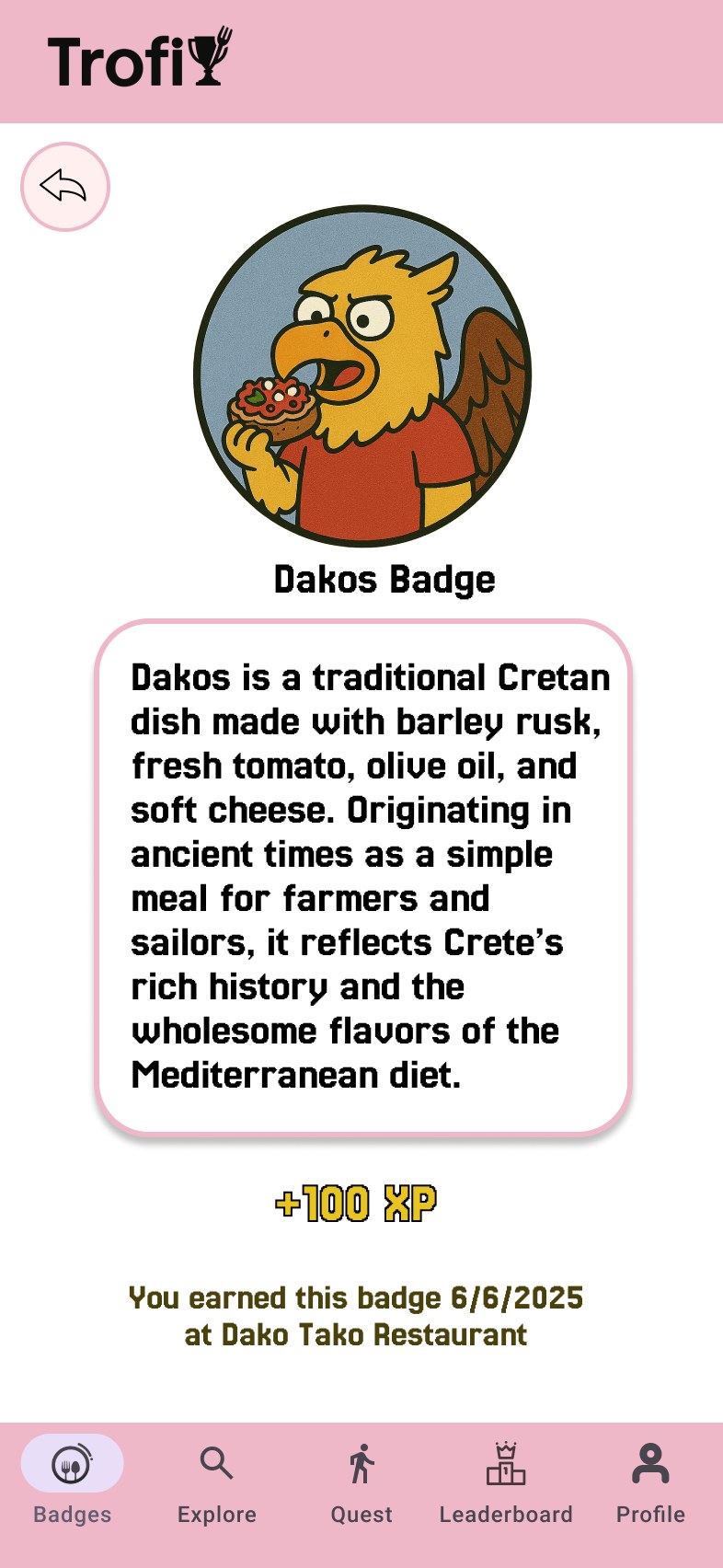
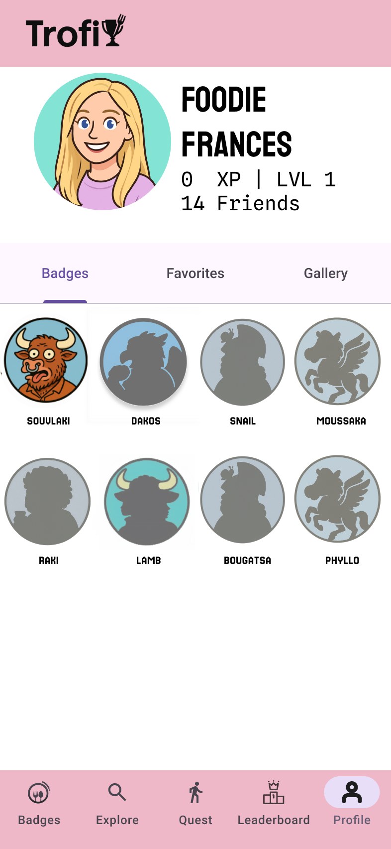
Users progress through a map of checkpoints, each representing a traditional Greek dish (i.e. souvlaki, dakos, moussaka, or more adventurous options like snails, which carry higher XP value) that the user chooses and tries.
At a participating restaurant, users scan a QR code on a branded placemat alongside a photo of their dish to verify and earn the badge.
Earning enough badges levels users up and unlocks a discount at partner restaurants.
 Raki
Raki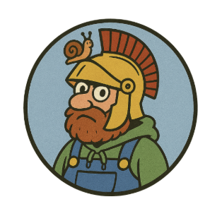 Snail
Snail Moussaka
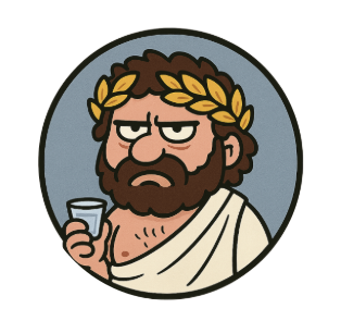
Sample badges, each tied to a bit of Greek lore.
A leaderboard adds a competitive layer among friends and the local player base.
The incentive for authentic restaurants to participate lay in the fact that the app would direct tourists to them, so they would lose less traffic to tourist traps.
Research & design decisions
Personas and journey mapping
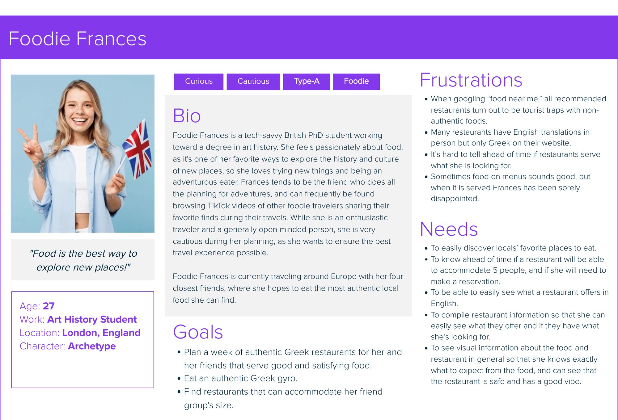
We built our first persona, Foodie Frances, to showcase a common frustration: restaurants often look legit on their google page, only to be cheap tourist traps or have inauthentic menu items. Foodie Frances's journey map showed this "false positive" moment, followed by the letdown.
Early usability testing
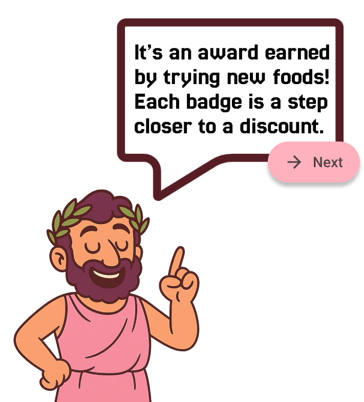
We tested paper prototypes early, then a Figma prototype in the field with real tourists. Our clearest finding from the early tests was that testers didn't understand what a "badge" was without context, nor did they quite understand the point of gaining them. In response, we built a guided onboarding sequence with an illustrated guide character who introduces badges and leveling before users are set loose on their own.
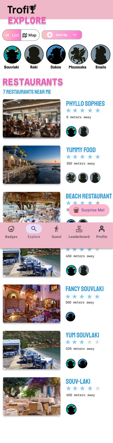
Other small findings also shaped the UI, such as low visibility on secondary buttons, an unclear tap target on our "Surprise Me" feature, and a restaurant menu preview testers expected to be interactive. Each led to a targeted fix. We also added a safeguard against an edge case involving possible cheating: the "I'm Here" button stays disabled unless a user is actually at the right restaurant (requiring location services to be enabled), preventing false badge claims.
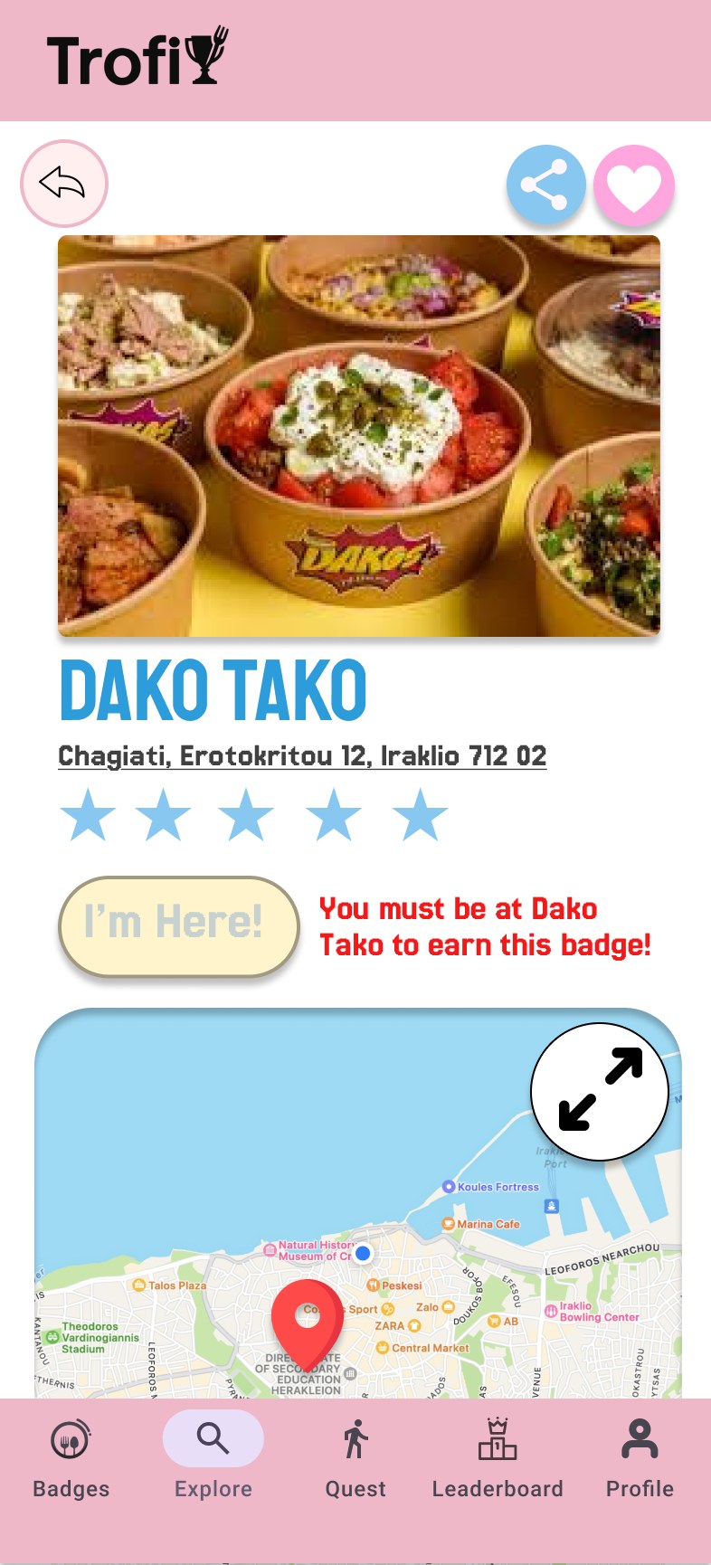
The disabled state, with a clear explanation of why.
Intermediate iterations and wireframing
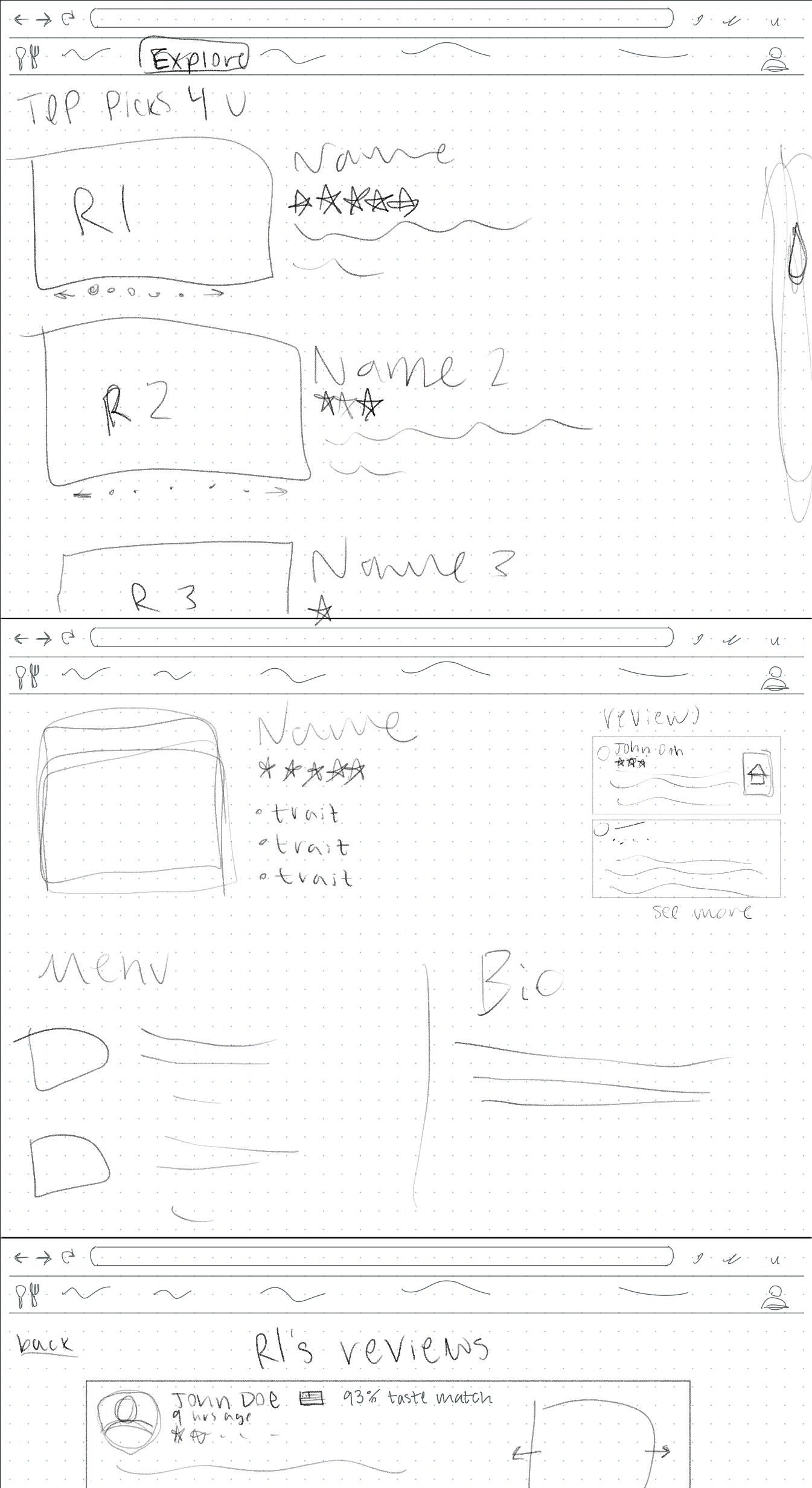
Hand-drawn wireframe from when Trofi was still a restaurant-sorting website, not an app.
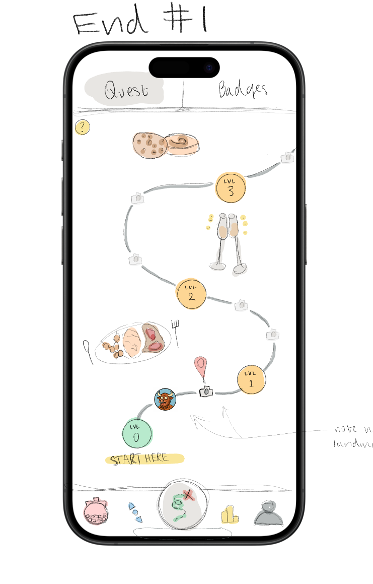
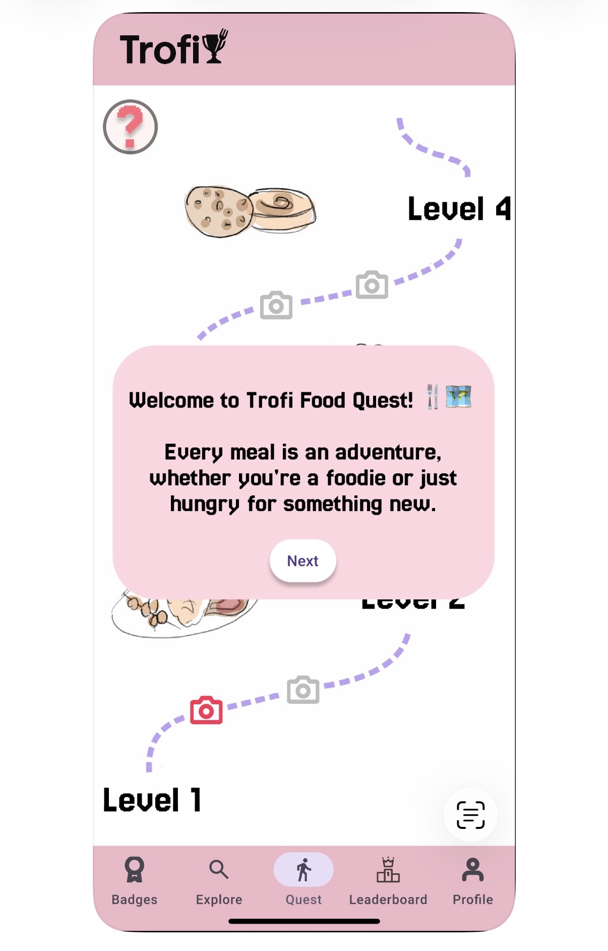
A slightly higher-fidelity pass at the onboarding overlay.
Final testing
Our last round of guerrilla testing involved more street interviews where we gave the participants a fairly vague goal (participants were asked to reach level two to earn their discount) and took note of how they navigated the prototyped product. Testers who put genuine effort into completing the flow received a gift card to a local café in compensation, allowing them to truly experience the earning of the discount shown in the app.
Final product
A walk through the core loop, end to end.
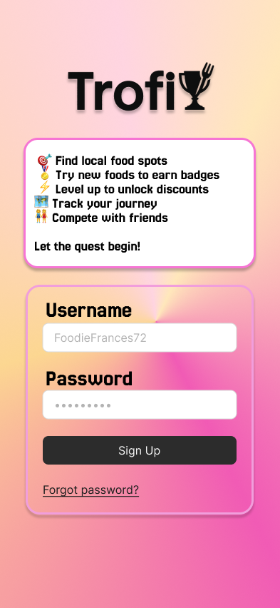
New users create an account before starting their first quest.
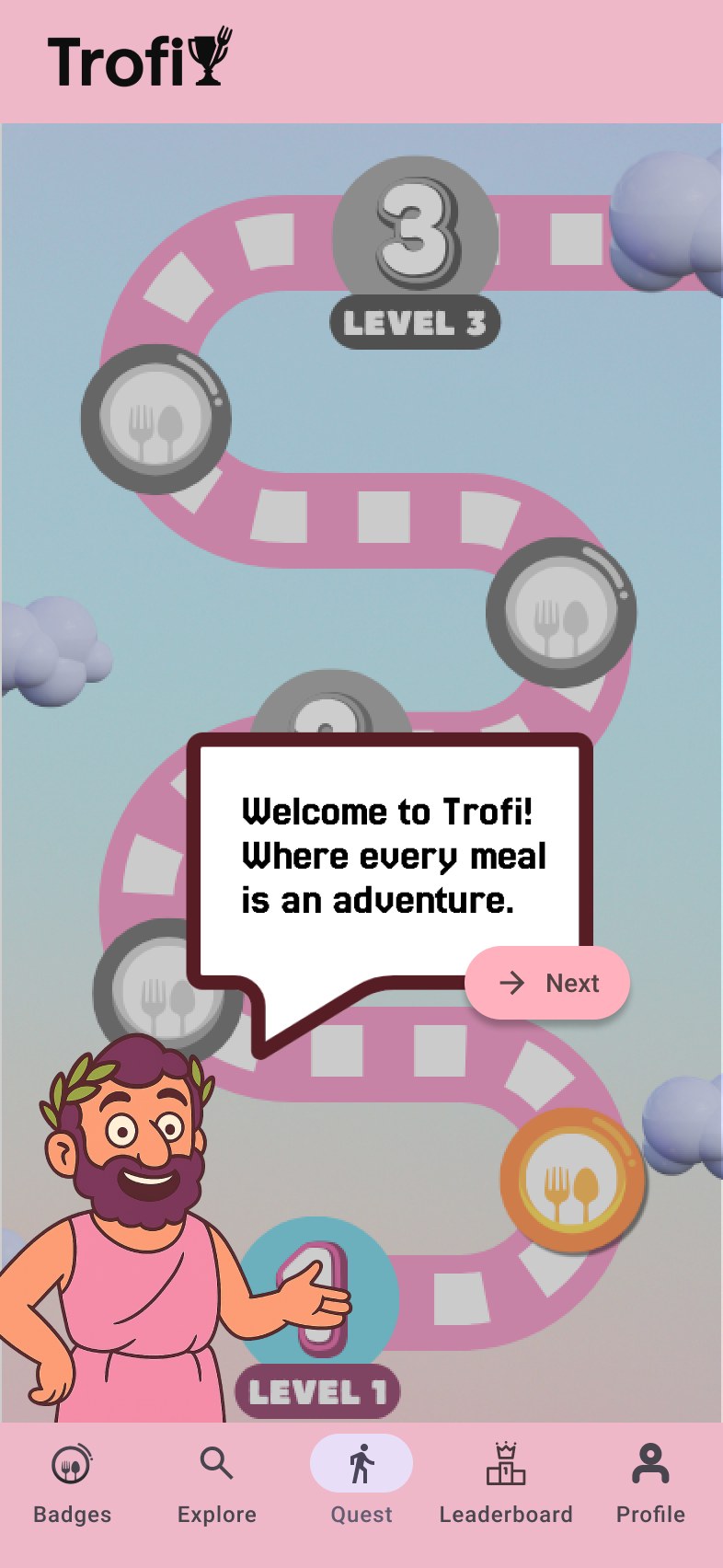
The illustrated guide walks first-time users through what a badge is before they're on their own.
Checkpoints along a path, each representing a dish still to try.
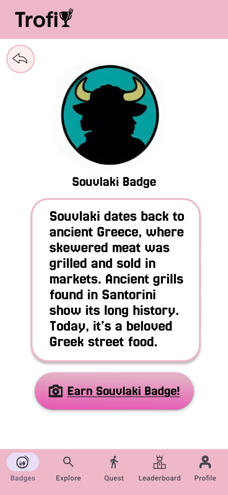
Each badge page includes a short history of the dish before users commit to earning it.
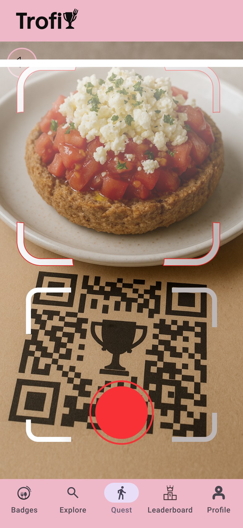
Scanning the placemat QR code alongside a photo of the dish verifies and earns the badge.
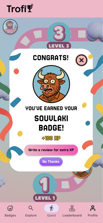
Earning a badge triggers a full-color reveal, XP, and a prompt to leave a review for bonus points.
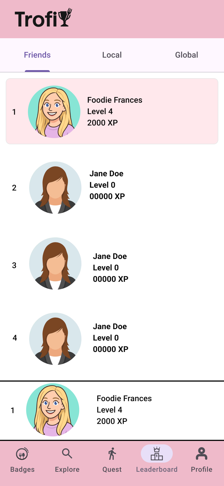
A leaderboard adds a light competitive layer among friends and the local player base.
The Explore page lists nearby partner restaurants, filterable by badge.
Validation & reflection
At the end of the three-week program, we presented Trofi to our professors for a grade, and separately to professional UX researchers at the Foundation for Research and Technology Hellas (FORTH).
Presenting at FORTH was a chance to get feedback from people outside the classroom, with real research backgrounds, on a product we'd built from scratch in three weeks. Since the program ended there, we weren't able to act on the feedback the professionals gave us, but it gave us a clear sense of what to focus on if we were to pick the project back up in the future. We left the program with a fully prototyped, end-to-end product, as well as real experience with user testing and evolving design iterations.
If I could redo this project, there are two main issues that stand out to me:
- Scope: certain features like the "Surprise Me" gumball machine were fun to conceptualize and design but pulled focus from the app's core mechanic of guiding tourists to authentic food. With more time, I'd probably cut anything that didn't directly serve that goal rather than let novelty features compete with it.
- Visual identity: The app's pink color scheme started as a placeholder while we figured out our real palette, and it accidentally stuck. By the time we noticed, it had already shaped other decisions, such as the guide character's design and the quest map's styling, in ways that were hard to undo without reworking a lot of the visual system. The result reads girlier and more childish than the concept called for, and it's not the tone I'd choose intentionally for a product aimed at a broad range of travelers. It's a good reminder to lock in foundational design decisions like color early and deliberately, rather than letting a placeholder become the default due to the momentum of building the product.